


Role: Associate Creative Director, Writer
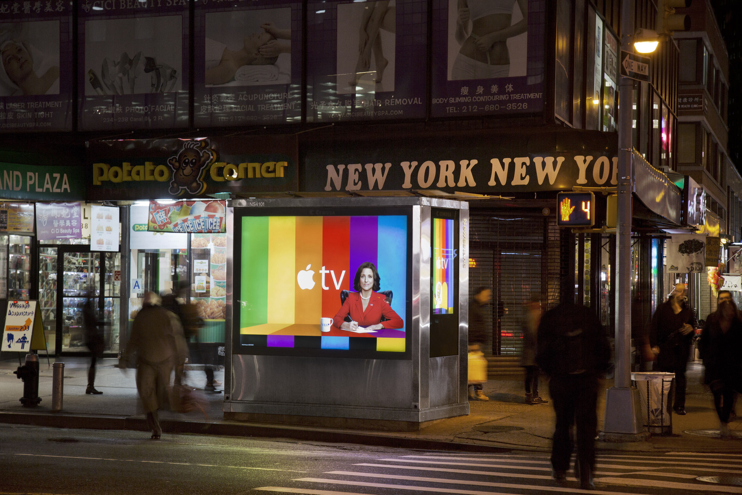
Remember the test pattern? Those color bars that used to fill your screen when the broadcast cut out — "we'll be right back," basically, in rainbow form.
We stole it. Rebuilt it. Turned it into the whole campaign.
The colors weren't random — they came straight from Apple's earliest logos, so the whole thing felt inevitable in hindsight, like it had always been sitting there waiting to be used. The idea: Apple TV wasn't just launching a service, it was interrupting the entertainment landscape the same way that test pattern used to interrupt your show. Disruption, but make it graphic design.
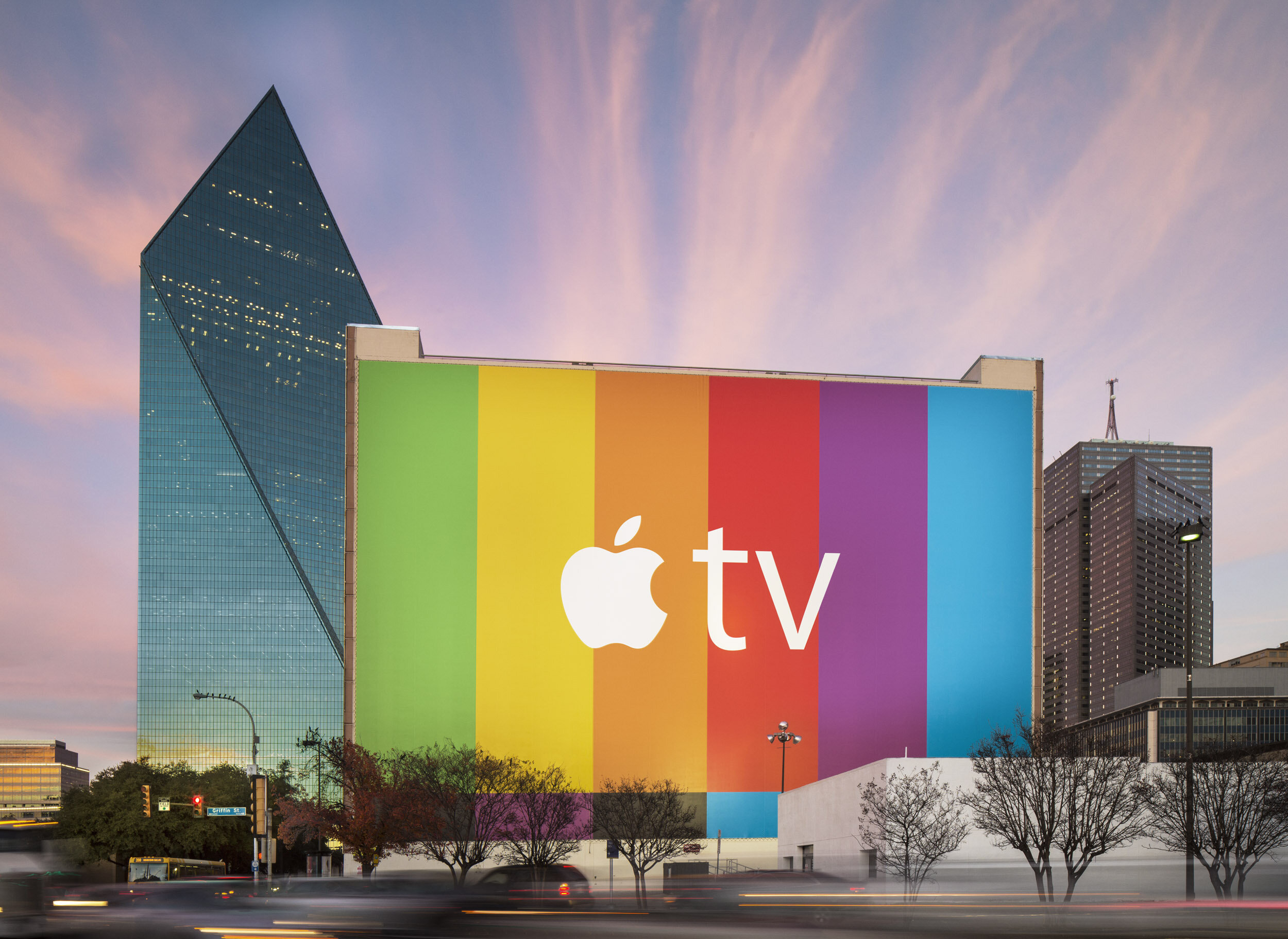
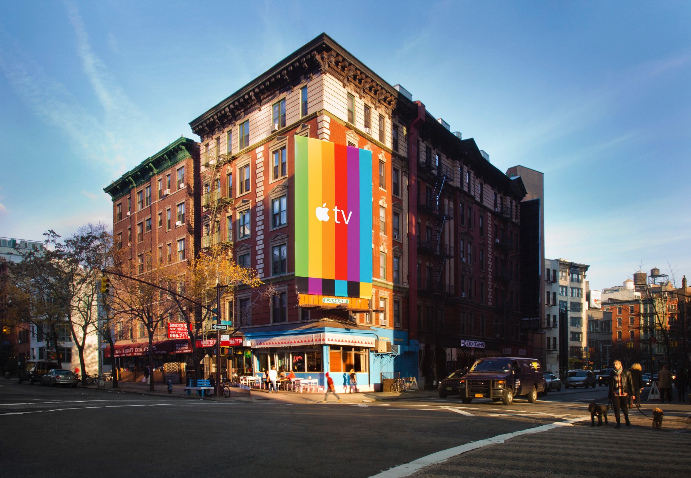
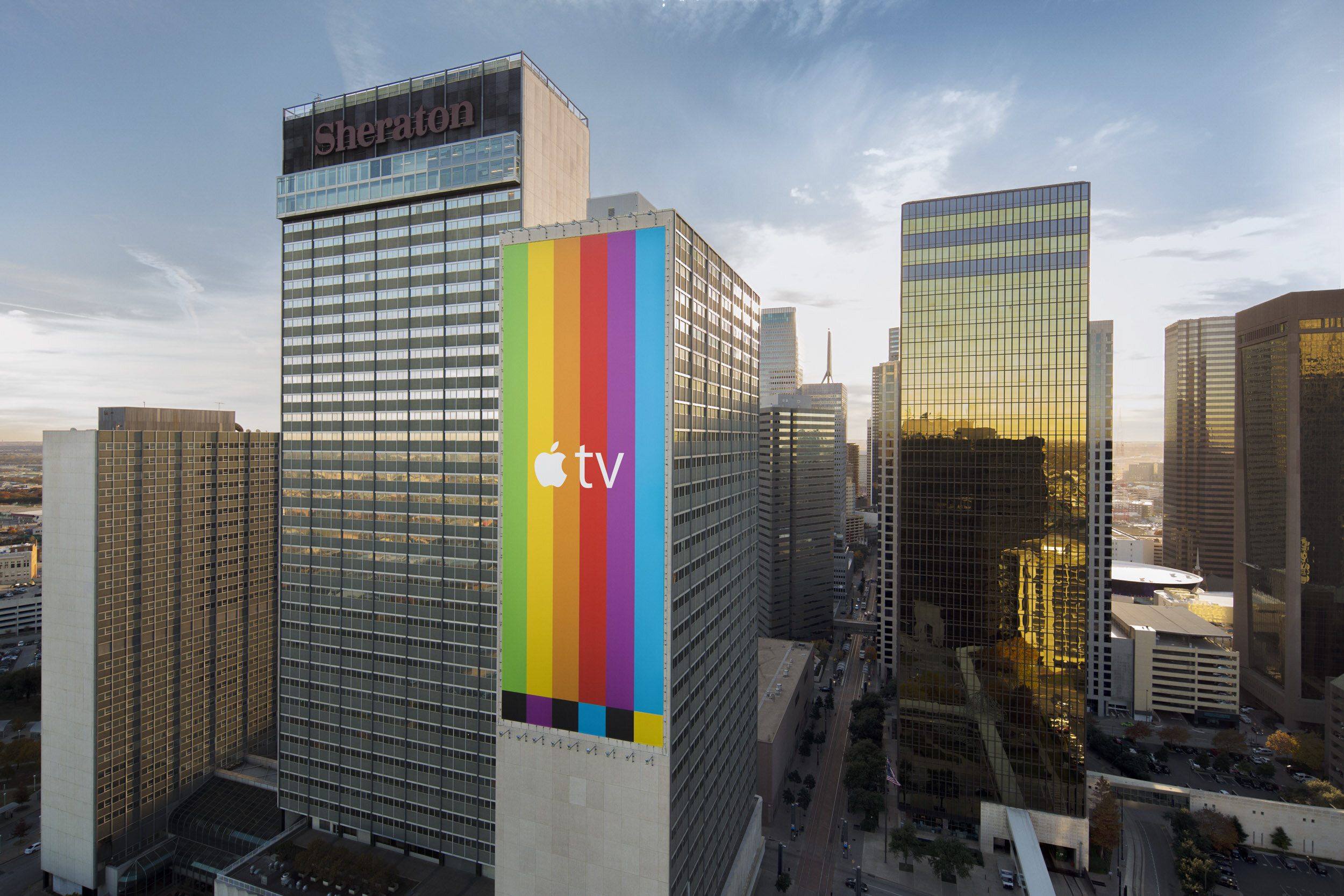
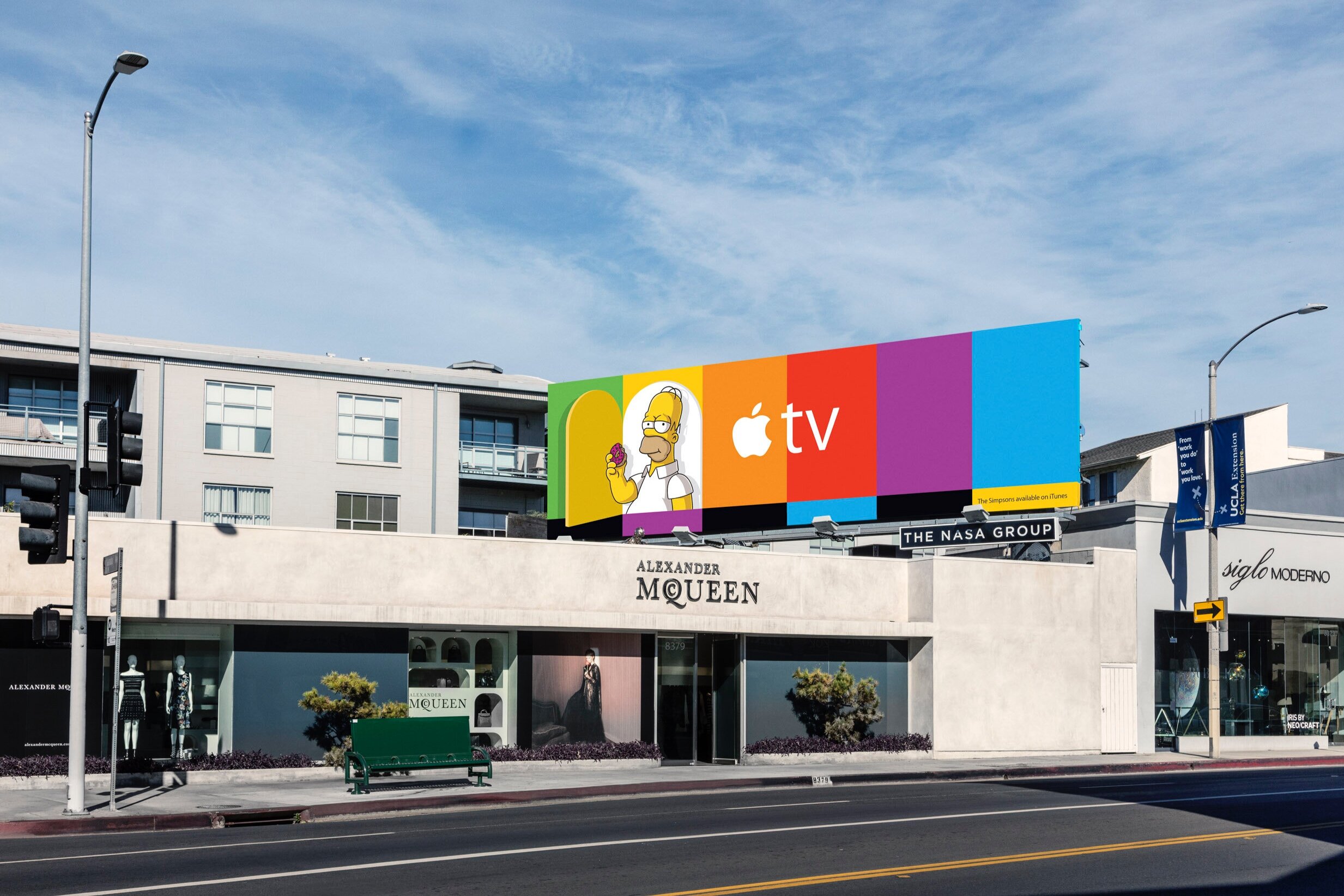
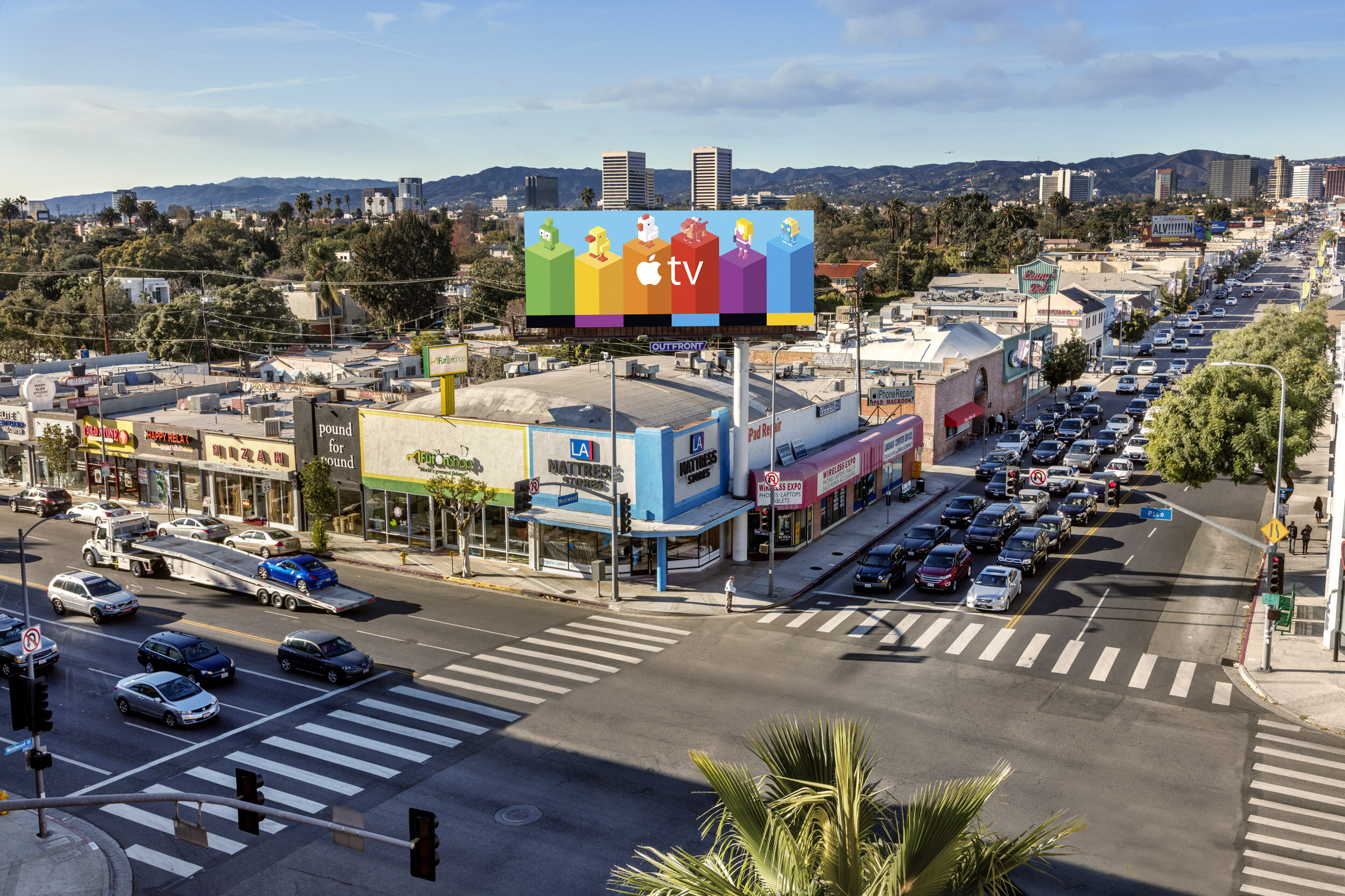
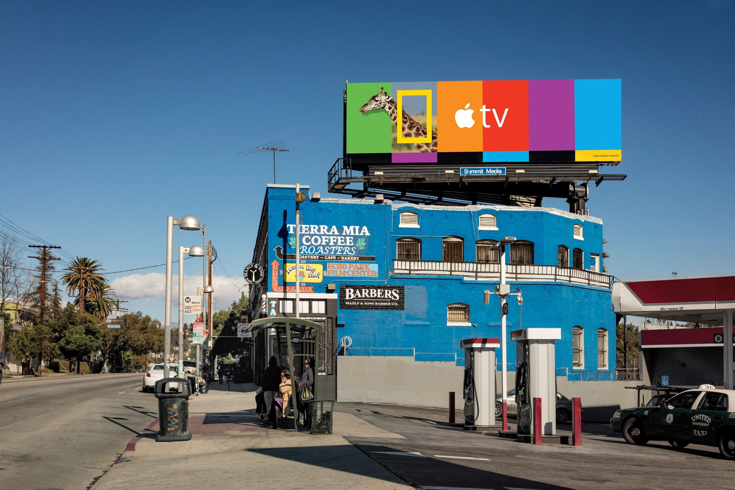
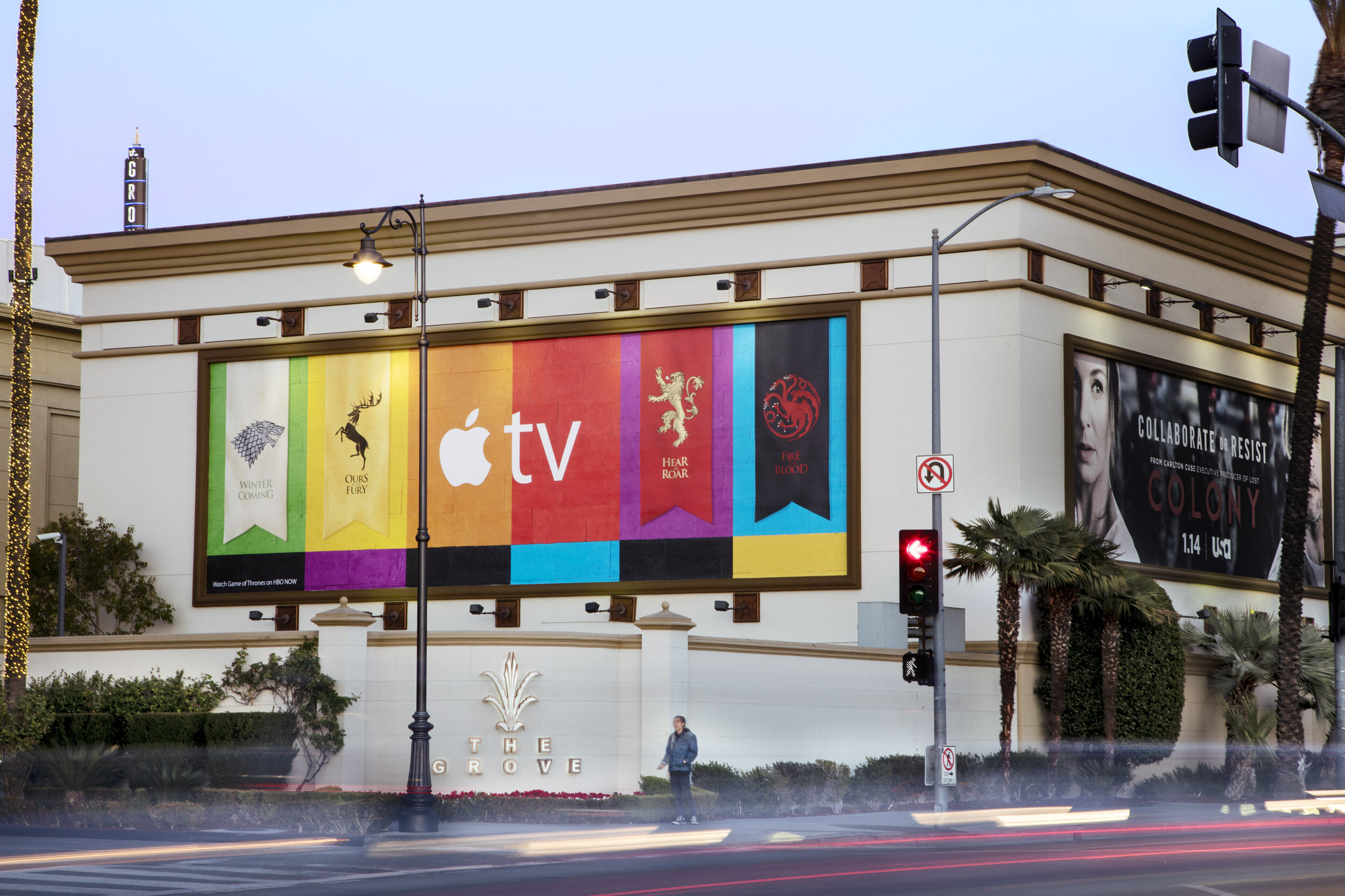
We rolled it out in two moves. First, we blanketed major cities in nothing but the bars and the Apple TV logo — bold, confident, deliberately withholding. No cast, no taglines, no content. Just: something is happening. Then, once the city had the pattern memorized, we broke it — swapping in glimpses of what was actually on Apple TV. Game of Thrones. Inside Out. Crossy Road. The NBA. The bars cracked open to reveal the content underneath, block by block, board by board.
The result: an entire urban landscape doing a slow reveal, and by the end of it, nobody was wondering what Apple TV was for.
Edited by Damion Clayton at RPS.
:15 Pre-roll
:15 Pre-roll
:15 Pre-roll